How to create a brand logo grid

In this post I will demonstrate how to create a brand logo grid like the one below:
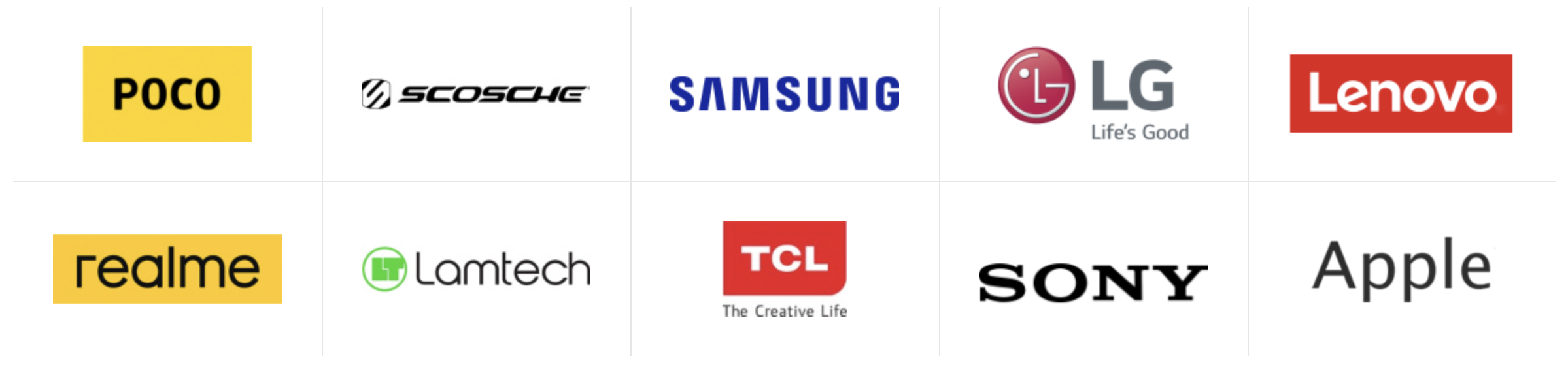
The tricky part of such a grid is the colored gap between the logo tiles.
The solution I came up with, I think is acceptable. I added a 1px box-shadow to the grid items, and I used the wrapper’s :after element to hide the "border" around the grid
.brand-grid {
  flex-grow: 1;
  display: grid;
  grid-template-columns: repeat(auto-fill, minmax(230px, 1fr));

  // this is the empty space where the lines will go
  gap: 1px;

  width: 100%;
  position: relative;

  &:after {
    content: '';
    position: absolute;
    // Remove pointer events because
    // this element covers everything.
    pointer-events: none;

    // By using negative inset value
    // we make the :after pseudo-element
    // 2px larger than its parent.
    // This is because the lines that we want to hide,
    // overflow the container because they are shadows.
    inset: -2px;

    // this 3px box shadow will hide
    // the overflown lines, and 1 more px.
    box-shadow: inset 0 0 0 3px #fff;
  }

}

.item {
  padding: 30px;
  display: grid;
  place-items: center;
  box-shadow: 0 0 0 1px #ddd;
}
About the author
I am a web developer from Greece, working mostly with Laravel.
Comments
Join the discussionNo comments yet. Be the first to comment.