
How to create an interactive gradient scrollbar
I am a web developer from Greece, working mostly with Laravel.
I was recently working on implementing a new design for a project. The site branding had two main colors, and, even though it was not in the design, I thought I would change the scrollbar background to the primary branding color.
It was better than the default browser scrollbar, but I had the idea to make it even better. So I decided to make a gradient scrollbar using the two branding colors. But having the scroll thumb with this gradient background wasn’t enough either… so I decided to make it more interactive.
My Idea was as you scroll, the scroll thumb background should change, starting from the primary and ending with the secondary branding colors.
This is how I did it. This works only on WebKit browsers of course.
First lets see the default scrollbar
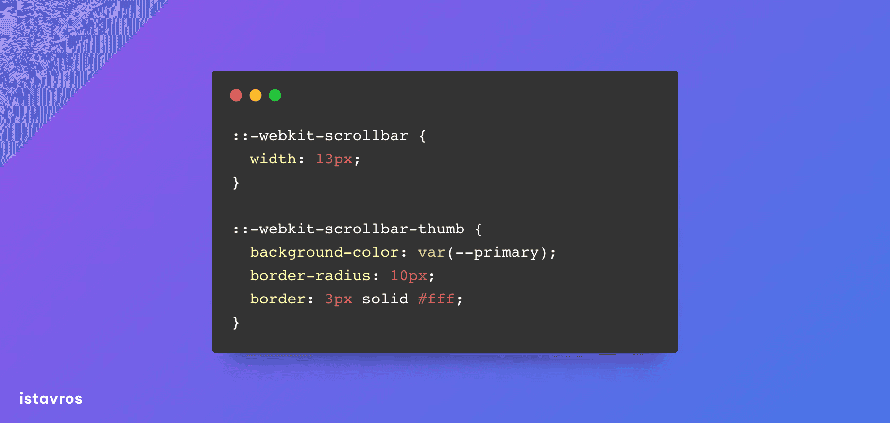
I changed from that to only having a solid color scroll thumb
:root {
  --primary: #007ac3;
  --secondary: #d2232a;
}

::-webkit-scrollbar {
  width: 13px;
}

::-webkit-scrollbar-thumb {
  background-color: var(--primary);
  border-radius: 10px;
  border: 3px solid #fff;
}
Next step is to make the gradient. I set the gradient background to the scroll track.
:root {
  --primary: #007ac3;
  --secondary: #d2232a;
}

::-webkit-scrollbar {
  width: 13px;
}

::-webkit-scrollbar-track {
  background: linear-gradient(
    to bottom,
    var(--primary),
    var(--secondary)
  );
  border-radius: 10px;
}
Then I tried to create a scroll thumb with a “hole” to reveal the gradient background.
:root {
  --primary: #007ac3;
  --secondary: #d2232a;
}

::-webkit-scrollbar {
  width: 13px;
}

::-webkit-scrollbar-track {
  background: linear-gradient(
    to bottom,
    var(--primary),
    var(--secondary)
  );
  border-radius: 0 10px 10px 0;
}

::-webkit-scrollbar-thumb {
  background-color: transparent;
  border-radius: 10px;
  border: 3px solid #fff;
}
And now the only thing missing is to hide the rest of the scroll track. I used a really large outline on the scroll thumb for that.
:root {
  --primary: #007ac3;
  --secondary: #d2232a;
}

::-webkit-scrollbar {
  width: 13px;
}

::-webkit-scrollbar-track {
  background: linear-gradient(
    to bottom,
    var(--primary),
    var(--secondary)
  );
  border-radius: 10px;
}

::-webkit-scrollbar-thumb {
  background-color: transparent;
  border-radius: 10px;
  border: 3px solid #fff;
  outline: 99999px solid #fff;
}
And this is the final result
If you liked this small tip, share it with your friends…